
CASE STUDY: Redrose Nutraceutical
A brand transformation that increased sales by 300%
PROJECT BACKGROUND
Redrose Manufacturing Ltd are a neutraceutical manufacturer that approached us with several problems;
- Whilst the business was functioning well in organic & word of mouth sales, gaining new business wins via marketing channels was proving difficult
- Their existing brand was dated and ineffective at communicating what they actually did, and there was no consistent application of their visual identity across any marketing communications
- The website wasn’t performing well in generating enquiries and promoting the wide range of Redrose services
- They had no print-based marketing materials or social media presence
- They wanted to promote their services at industry events and needed exhibition materials
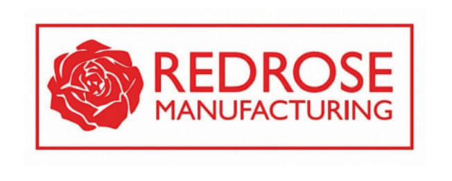
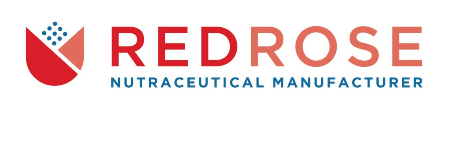
Above: The old Redrose logo was dated and provided no indication of what the services offered. Our research showed most people thought Redrose operated in the engineering sector – this had to change, and it did with the new brand logo we produced below.
KEY RESULTS WITHIN 3 MONTHS
%
Increase in SALES
%
Increase in web enquiries
SOLUTION
Reactive identified where significant, ‘quick-win’ marketing improvements could be made and we focussed our efforts on the below areas:
-
Brand identity refresh
-
Website redesign
-
Printed brochures
-
Exhibition materials
-
BUSINESS Stationery
-
Photography
-
Social media collateral
BRANDING
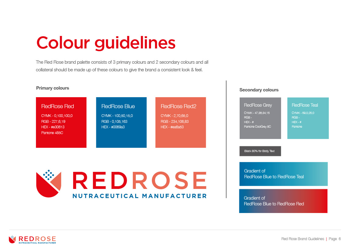
In terms of the Redrose logo itself, it was modernised to instantly communicate what Redrose do, including the formulation of a new strapline (Netraceutical Manufacturer). A new and distinctive abstract rose icon was developed that pays homage to the old ‘rose’ icon, but has a dual meaning as it also represents the capsules and tablets that Redrose manufacture. As a key USP of Redrose is their British origin and use of ingredients sourced in the Uk & EU, a red/blue colour palette was developed.
A detailed brand guidlines document was also created to ensure consistent application of the new visual identity.
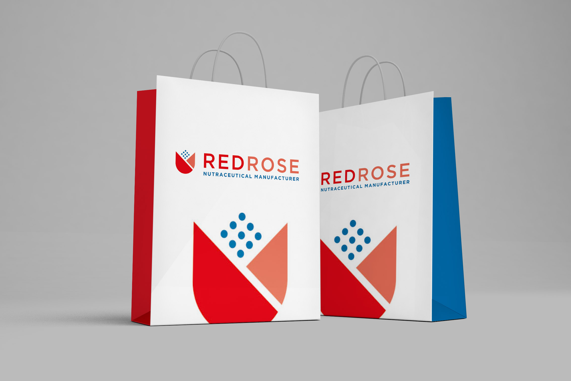
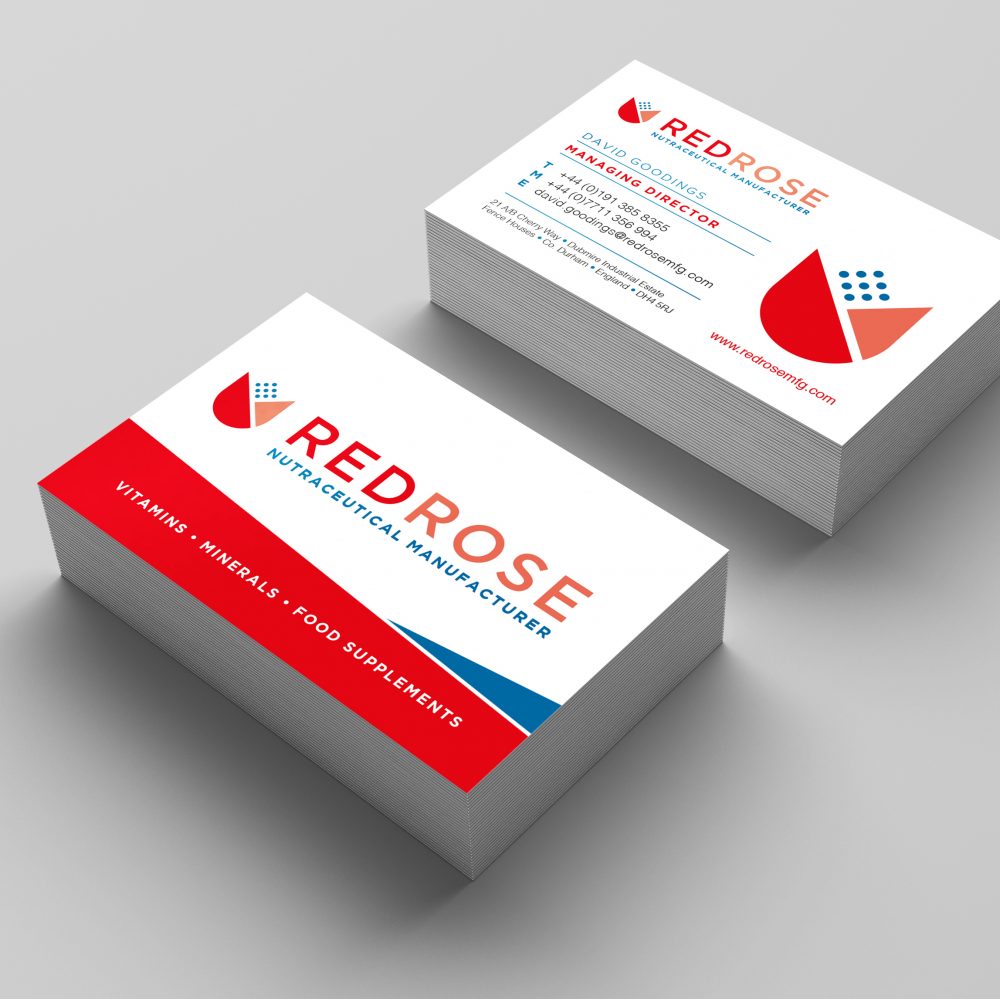
BUSINESS STATIONERY
To promote a new and improved identity, the new branding was rolled out across a whole host of stationery to give them all the distinctive ‘Redrose look’ as well as conveying a more professional image . This included:
-
Business cards
-
Letterheads
-
HTML Email signatures
-
Factory signage
-
Invoice Templates
-
Word Document Templates
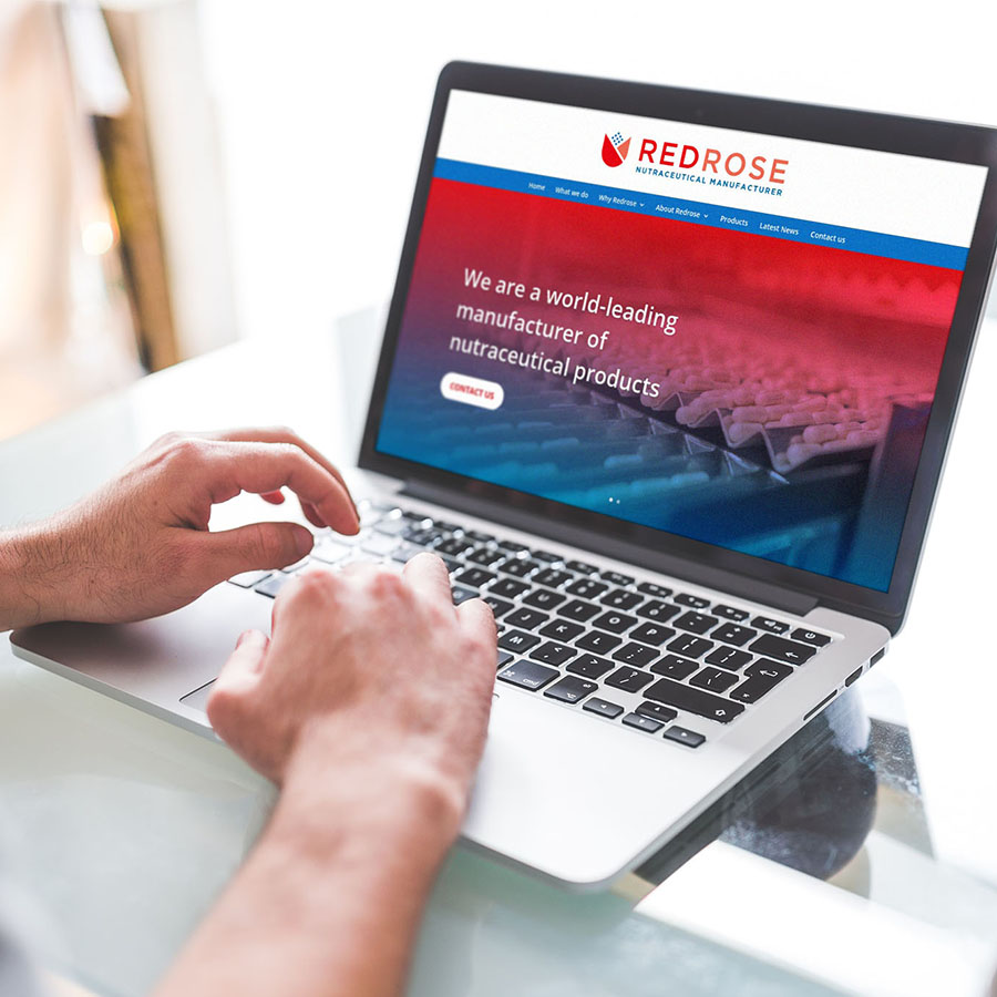
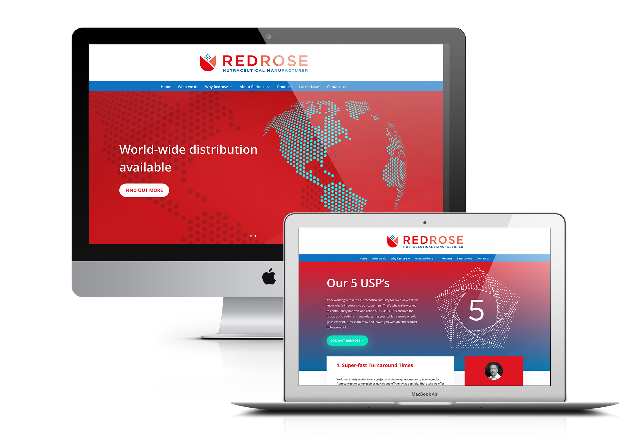
WEBSITE
The website was completely refreshed to showcase the new identity and we also completely rewritten the website copy to promote the Redrose USP’s, services and products in a distilled manner that was very benefit driven with clear calls to action.
Visually the whole look & feel was revamped to reflect the energised brand and stylish graphic techniques where implemented to bring out the key messaging. The site is mobile responsive as standard and uses an ‘easy-to-manage’ CMS for the client to update content and add regular latest news which is important for SEO.
EXHIBITION MATERIALS
With a distinctive brand to be now proud of, a number of events in the neutraceutical industry where identified as a way to engage with new customers.
To help with this Reactive produced large format exhibition signage to help Redrose really stand out at these events, along with printed marketing materails like brochures to hand out to potential customers. These events proved to be very successful in generating new leads.

BROCHURES
To effectively engage with customers it’s important to enagage with them through all channels – whether online or in print.
We created print promotional materials, such as simple 6pp A4 Brochures, wheich really distilled the Redrose message into a way that would immediately get across the benfits of using Redrose and appeal to their target audience.


SOCIAL MEDIA CAMPAIGNS
Social media was an area where previously Redrose had no presence. They were definitely missing an opportunity to engage with their target audience and initally we set up branded pages across all major social platforms.
From there we helped devise a plan for regular social media campaigns and topics, as well as producing supporting graphics around key themes. A major key theme to push initially was to promote the 25th Anniversary of Redrose as a company – which is a major success in itself. And now after 25 years the client had a brand they wished to shout about.

RESULTS:
As you can see a lot of effort went into the Redrose Brand Transformation and the results of our work speak for themselves:
“I cannot thank Reactive enough for all of the help, guidance, expertise and support given for the new branding, website development, and promo materials. It has helped transform our business and we look forward to continuing to work with you in the future!”
%
Increase in SALES
%