Hartlepool Council
DESIGN & PRINTCLient
- Hartlepool Borough Council
Services
- Brochure design
- Branding
Deliverables
- 28 page brochure
Other
- Supplementary style guide
Project Info
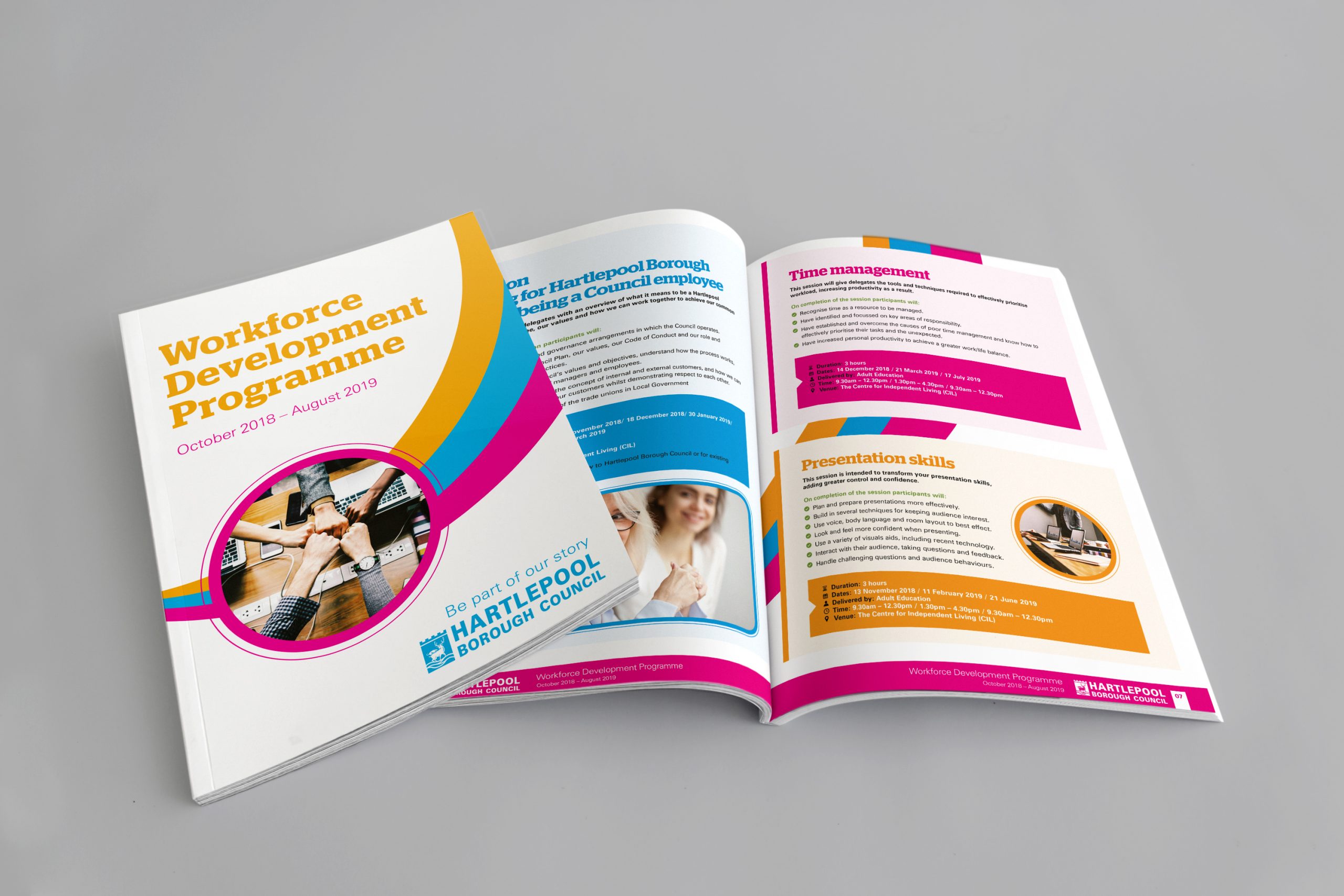
Challenge
Hartlepool Borough Council approached us with a need to produce their 28 page Workforce Development Brochure with a completely new look & feel to their usual stuff. Their biggest challenge was that much of their existing literature and promotional items had the same tired look, using the same dark green & blue. They wanted to diversify their visual identity into something more vibrant & appealing as well as introduce a secondary headline font.
SOLUTION
We gained a clear understanding of the clients need to tinker with their rigid brand identity and why, and also what they where trying to achieve with a more vibrant brand.
We then set-about producing some sample visual concepts and page layouts to meet their brief and in working with the client we evolved a new and fresher look & feel. This was then rolled out throughout this particular brochure, but also set the standard and tone for a looser brand identity which introduced a secondary colour palette and dynamic curve graphics. The project represented a key visual change for the council which continues to this day and coupled with our extensive print expertise and cost-effective print buying – it was an excellent value project for the council.