TICA ACAD
BRANDINGCLient
- TICA ACAD
Services
- Brand Guidelines documents
Deliverables
- 10+ Pages
- Application
Other
- Website
- Other marketing collateral

Project Info
Challenge
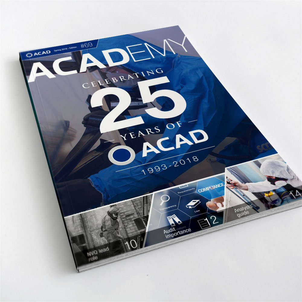
TICA ACAD’s logo had evolved multiple times, with various versions having differing sizes of their circle icon as well as being positioned to the right & left of the logo text. Confusingly when the circle ws positioned to the right the logo read as ACADO or TICAO.
They needed to finalise their logo and have a set of brand gudilines produced which ensured consistent application of the logo.
SOLUTION
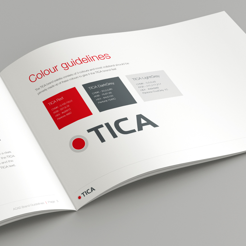
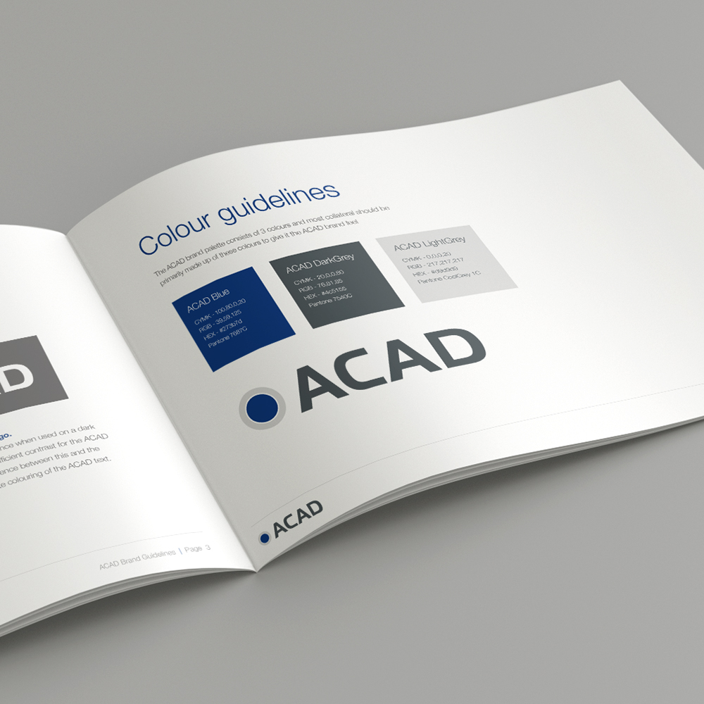
Reactive are very experienced in producing brand guidelines so we set about creating 2 documents for each brand which contained all the do & don’ts for logo usage as well as defining primary & secondary fonts and a colour palette.
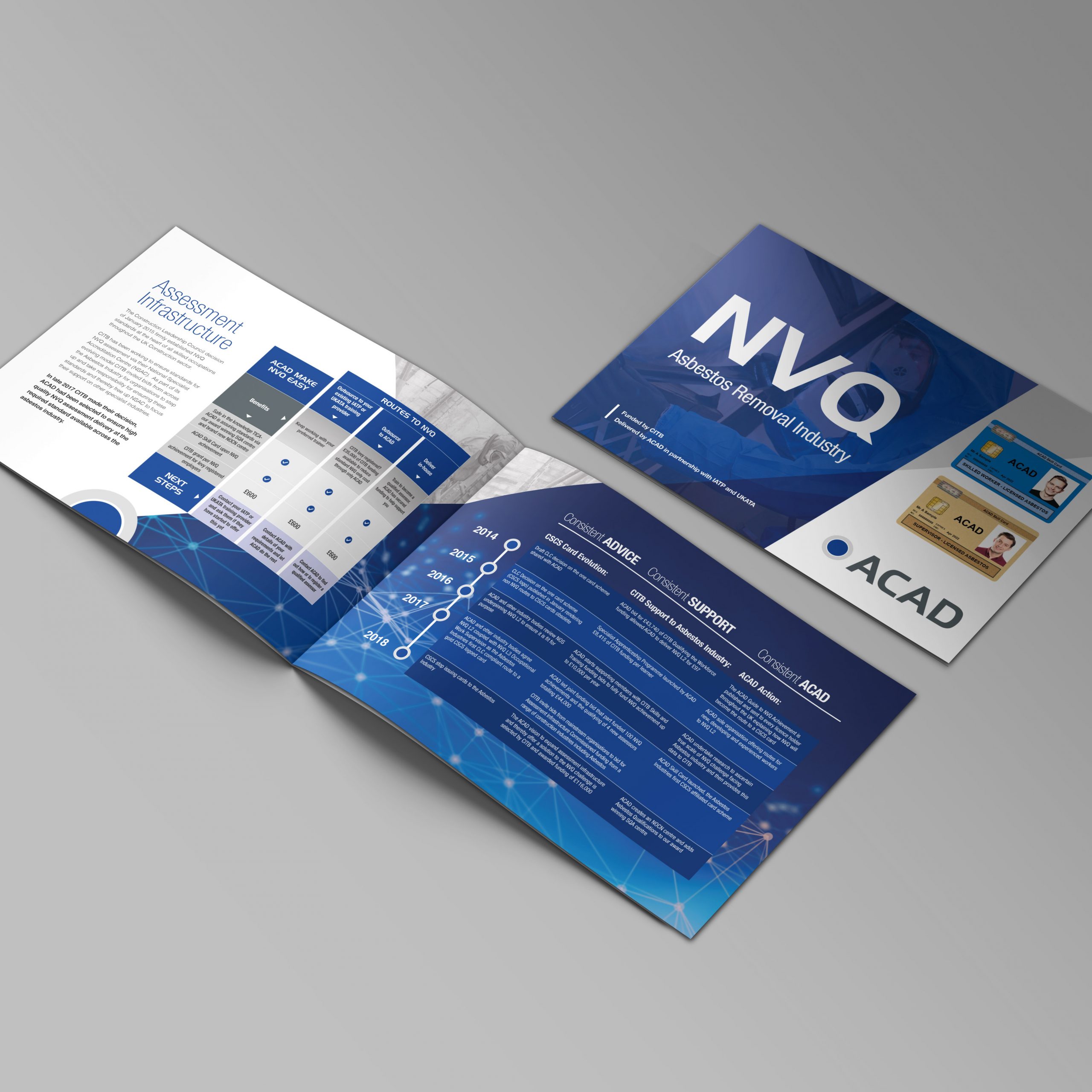
This meant that all subsequent marketing materials that we produced for TICA ACAD has a consistent identity.