THE IMPORTANCE OF A STRONG BRAND IDENTITY
Direct Insurance Group are a long standing client of Reactive Design of over 14 years, and we produce creative work for them across multiple-channels, including online (responsive websites and triggered email communications) and in print (brochures, exhibition stands, ads).
To stand out in the market place you need a clear and consistent identity
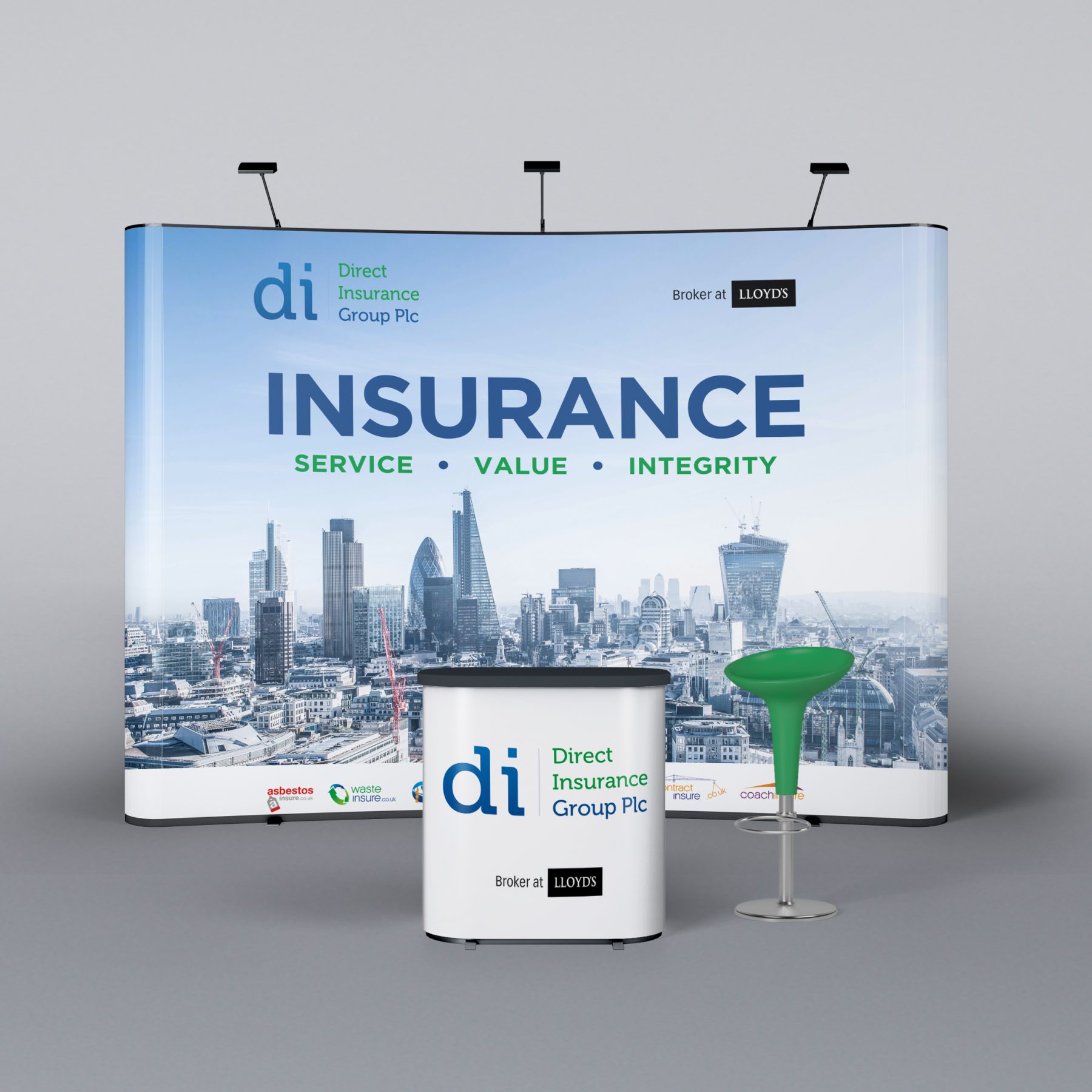
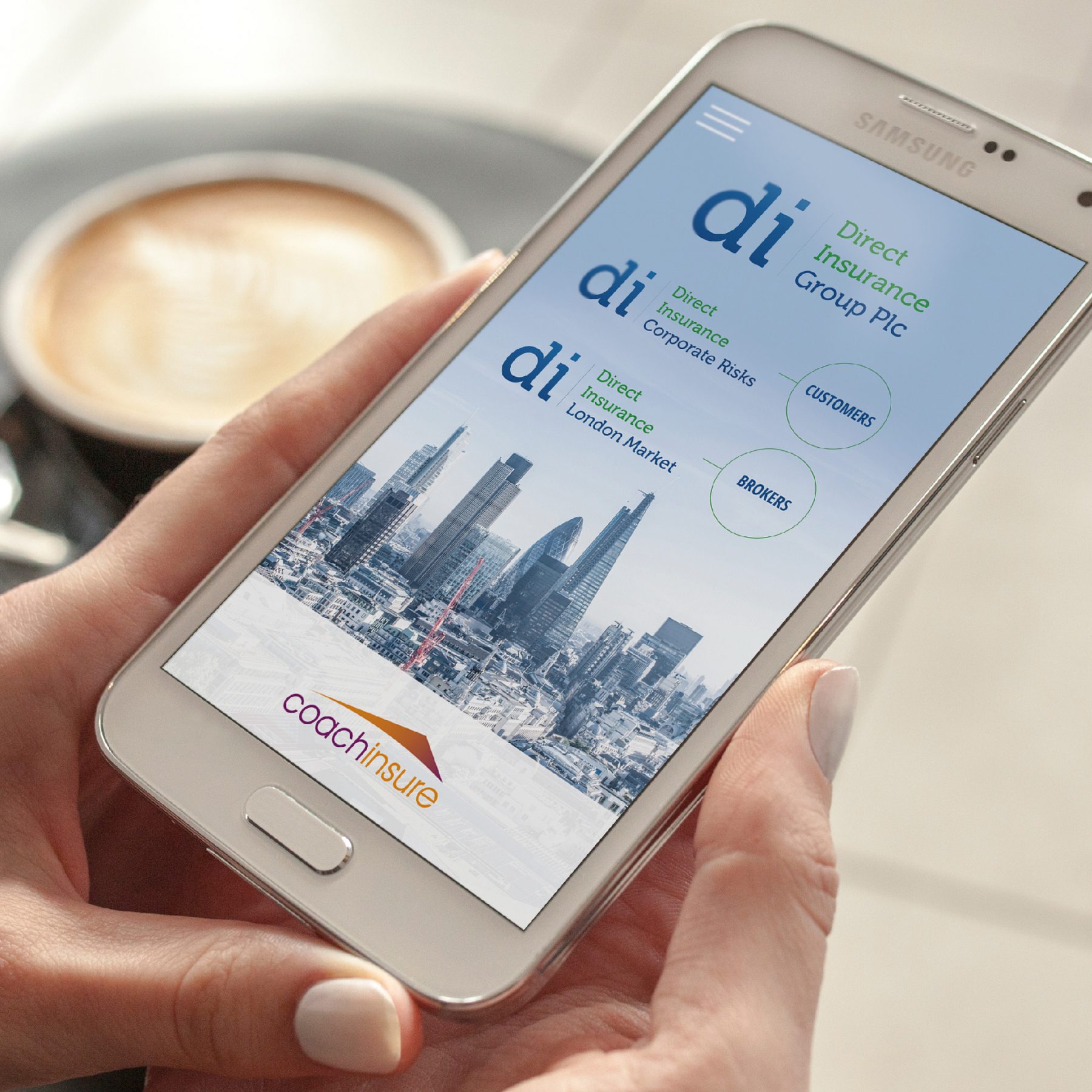
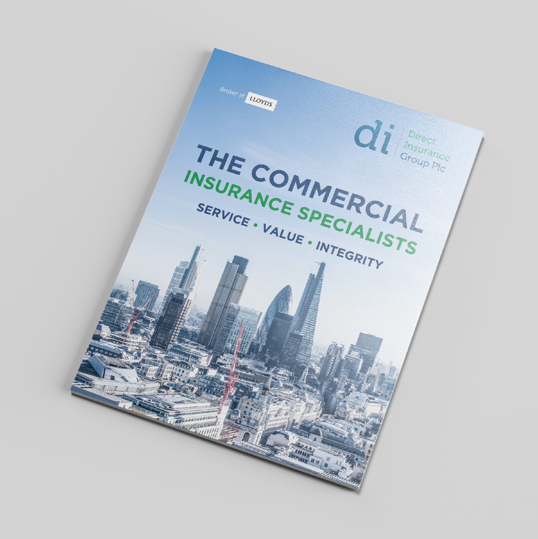
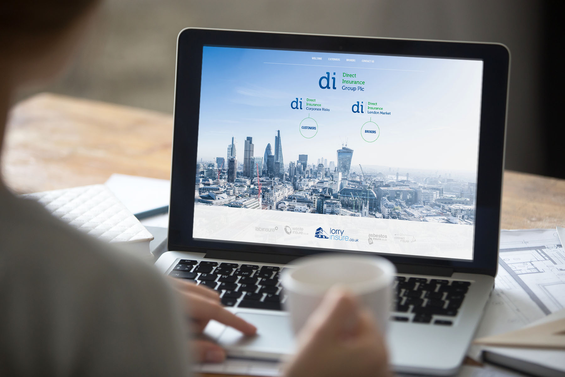
In Direct Insurance Group’s latest marketing collateral they needed a strong and consistent market presence to distinguish themselves from the competition and reinforce their key messages of Service, Value & Integrity as well promoting their Lloyd’s Broker status – which is a key selling point of Direct Insurance Group. Because of the multiple-marketing channels in which they operate – Reactive Design proposed a visual approach which could be rolled out across all marketing channels and communicate the key messages. This incorporated a limited brand colour palette, minimal typographic elements to give focus to the key text content and use of a key photographic image of the City of London skyline to emphasise the association with and credibility of the Lloyd’s Broker status.
In Direct Insurance Group’s latest marketing collateral they needed a strong and consistent market presence to distinguish themselves from the competition and reinforce their key messages of Service, Value & Integrity as well promoting their Lloyd’s Broker status – which is a key selling point of Direct Insurance Group. Because of the multiple-marketing channels in which they operate – Reactive Design proposed a visual approach which could be rolled out across all marketing channels and communicate the key messages. This incorporated a limited brand colour palette, minimal typographic elements to give focus to the key text content and use of a key photographic image of the City of London skyline to emphasise the association with and credibility of the Lloyd’s Broker status.
“When you look at a strong brand, you see a promise”
Jim Mullen
Having ‘Lloyds Broker’ status is a promise of being one of the world’s leading insurance specialists
The Lloyd’s Broker status is a key selling point of Direct insurance so it was vital to emphasise this with the London City Skyline and consistent and clear use of the Lloyd’s Broker official logo.
The consistent visual approach that Reactive Design took means that every time a potential customer interacts with the brand they see a consistent message which is rememberable and repeated interactions whether online, in print or through events and Expos builds familiarity with the brand and thus are more likely to recognise and use the Direct Insurance Group brand.
A good visual identity should work well whatever the channel
With the identity we created for Direct insurance it was imperative that it would work well in print, online and in email – as well as a varying scales and formats. That’s exactly what Reactive Design created.